


Share this Post
 This month Scott Crawford’s highly anticipated restaurant, Crawford & Son, opens its doors. The four-time James Beard award semifinalist secured a coveted Forbes Five-Star award for Heron’s and received widespread praise at Standard Foods; however, this restaurant is his first solo endeavor and embodies more than his menu. The new logo incorporates an eagle that reflects his grandfather’s tattoo and reminds the chef of his working class roots, but it’s also a symbol of Crawford’s newfound freedom.
Crawford canvassed the city to find the perfect spot for his new 60-seat eatery, and when the former Piebird location became available he was immediately drawn to it. He reached out to friend and former collaborator, architect Louis Cherry (most recently known for the Living Kitchen in Charter Square). The two embarked on creating a simple yet refined design for Crawford & Son, and here they tell us about the journey.
How did you meet?
Cherry: We worked together when Scott was at Heron’s to redesign the kitchen and front of house.
Crawford: I loved working with Louis, and then we became friends and reconnected in a speaking engagement for CAM. We started spending time together so when I started looking at this space I called Louis as a friend first to say, ‘What do you think?’ We were both like, ‘oh yeah.’
Cherry: When you and [wife] Jessica first came to our house, you began to understand our design aesthetic. It was clear that we have a very similar kind of taste and sensibility about what we consider is good design.
Crawford: I started to realize there really wasn’t anyone else I wanted to call to help me with this project.
Have you worked on a lot of restaurants, Louis?
Cherry: I have been obsessed with restaurants and food for many years. I owned a restaurant for 10 years that was quite a good restaurant. It was called Enoteca Vin. I gave Ashley Christensen her first job as a chef and also Andrea Reusing, two pretty important chefs. So I designed my restaurants and I looked for opportunities to do restaurants, that care about design.
How did you choose this space, Scott?
Crawford: I looked at a lot of spaces and I wouldn’t feel it. It’s hard to articulate, but I have to feel some warmth or some spark about the place. I was looking at building after building. And when I walked into this space, although it was very weird looking from the last design, the bones were there and I was immediately drawn to it. I asked Louis if he had the same sense. It was pretty immediate. We both agreed this was something special.
How did you approach the design?
Cherry: I think where design gets off track is when it’s not about comfort and the experience of the diners, and it becomes about the designer at the expense of comfort.
Scott, you wanted to create a neighborhood eatery?
Crawford: I counted my residences once; I had had like 36. Really insane. So when I realized this is home and I want to get out of hotels, I started exploring downtown Raleigh more. It made sense, and I needed to find my pocket. I ended up doing the Standards Food project. I would walk out during service and see the same faces I would see on Tuesday as I did on Friday. They would want to talk to me, and it was exactly what I had hoped for. The idea to create a neighborhood restaurant was always at the forefront, and this doesn’t get much more neighborhood than that.
And you live in this neighborhood, Louis?
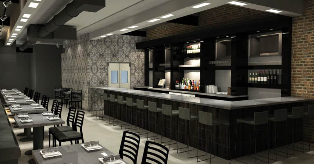
Cherry: Absolutely. I’m very selfish. When Scott and I first walked in there, it was clear that so many things were in place; the bar location was perfect. A few things needed to be tweaked but the fundamentals were there, and I think we quickly came to an understanding that we want to express quality through simplicity and refinement, pairing things down to an essence in terms of color, shape and materials. It’s kind of a minimalist aesthetic that allows the food to shine. It’s not fussy, it’s not overwrought. It’s not flashy.
Crawford: It’s about substance.
How do you describe the interior?
Crawford: Warm and rich.
Cherry: It’s grays and black with a few subtle accent colors.
Crawford: I love color in foods and obviously in tattoos. So when people say I never wear color, I argue with them because I wear color every day.
Cherry: We did talk about tattoo colors and an element of pattern that was inspired initially by tattoos. We were very conscious of not being part of the trends, doing something original and very specific to Scott’s personality.
Crawford: It was really Louis’s idea to have a monotone look, which is something I like in my dress and in my home, and I have this contrast of color and these patterns in the tattoos. Louis said ‘I think we can do that in this wall-covering that represents that contrast.’ We went through lots of ideas and settled on one that can be best described as “badass.” I love it. It doesn’t look like tattoos; it’s just inspired by it.
Cherry: For me, one of the things that clicked was the idea of how food is presented. When you present a beautifully plated dish, the table is simple so that the food sparkles. In a sense that’s a metaphor for the restaurant itself. The interior is very neutral, and the crisp little pops express pattern and color in the same way that food does.
What about some specific details?
Cherry: The tabletops are soapstone, which is a beautiful rich gray; it has some pattern but it’s subtle. The front door is going to be a walnut veneer; it’s very heavy and a very detailed entrance. A lot of design thought went into making the entrance so that when you walk through that door you really think about it. It’s going to be a dramatic experience. We’re using a back-painted glass backsplash at the bar, which is a very light powdery blue sort of based on the tattoos, a subtle color. The wall-covering has metallic aspects and a faded multilayered pattern. It signifies the kitchen and the food. There will be a wall of family photos, Scott’s family and a decorative chandelier. There’s no art except for the family art.
Crawford: The family photos have actually grown into a wall of family photos from the entire staff. Everyone is bringing black and whites of their parents, grandparents, great grandparents – really looking at our roots, you can see it. We all have this similar blue-collar background, it’s evident in the photos.
Related Articles


Share this Post