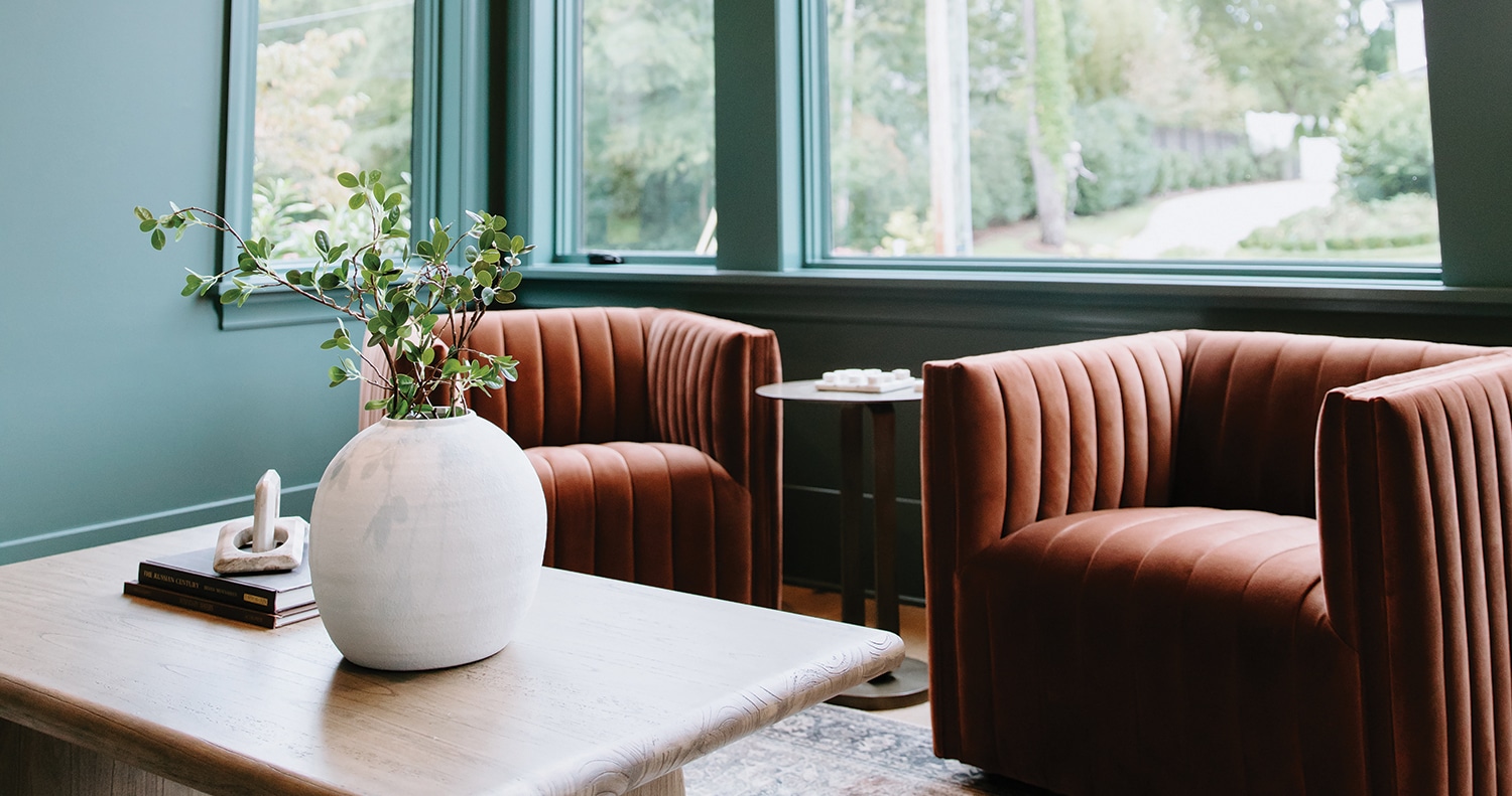
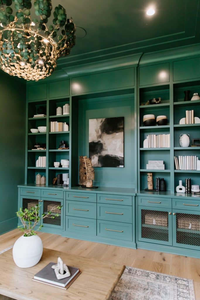
One is ~not~ the loneliest number when she’s got depth. Enliven—and enlarge—nooks by enveloping in rich hues, like the lush deep green that sweeps across these walls, ceiling and trim to create a seamless, monochromatic design. “Every element was meticulously curated to balance contrasting textures and tones,” says Linden Creek interior designer Katie Pinter of this verdant Raleigh Custom Homes study. The result? Less noise, more depth in a space that feels at once inviting and refined—cozy yet undeniably chic.
Designer’s Tips
Monochromatic Magic One color, infinite moods—single-color schemes like this rich-green hue can make rooms feel larger, as “the eye isn’t interrupted by stark color changes.”
No Filter, Just Fire Unleash your drama queen for full effect without overwhelming the space via bold pops of color, like the fiery flair—and luxe looks—delivered via these deep auburn velvet chairs.
Ground the Space Root your room in warmth with natural wood tones—whether in furniture or built-ins—to bring an earthy balance to a bold-hued room.
Shades of Gray In a world of color, unapologetically opt for black and white accents—think vases, books, etc.—to create subtle contrast and add a layer of mod refinement.
Orange you glad this bright and cheery color is finally having a moment? Add fun, decorative pops of orange to an otherwise neutral room and lift the spirits of all who enter there.
1. ADS Murano glass mango vase, $38; Form and Function 2. James Studio large cachepot, $33.99; small cachepot, $24.99; Inspirations 3. The Essential Bar Book by Jennifer Fiedler, $19.99; Form and Function 4. Ervin Edwards Design Buddha pillow, $195; For Your Convenience 5. “Bundle of Carrots” by Deb Hauser 13” x 7”, $195; For Your Convenience 6. Boston International carrot plate, $19.95; Zest 7. Glass spiral bowl, $59, Zest 8. Mangiacotti clementine shea butter soap, $9.50; For Your Convenience 9. Decorative large bowl, $85; Form and Function 10. Indoor/outdoor lattice rug 5’ 3” x 7’6”, $135.99: Target 11. Christopher Knight Home Mervynn mid-century recliner, $305; Target
With the color of the year being True Blue, there is no better accent color to go with than orange…and for me, it has to be as close to Hermès orange as possible, which I always find to be Invigorate, by Sherwin Williams.
Outrageous Orange is a bold hue. It usually is not the first color that comes to mind when designing a room, but a well-placed pop of orange can add warmth to any space. Outrageous Orange is an expressive shade, full of energy and joie de vivre!
Great in a room with lots of windows and the ceiling and carpet are ivory white. Throw in blue accents … I see a vase full of blue hydrangea and accent pillows in navy blue.
I like to use Benjamin Moore’s Orange Burst #2015-20. It is perfect for an active space in need of a strong color. Use it on an accent wall to motivate and inspire.
My favorite shade of orange these days is Sherwin Williams Hearty Orange SW6622. Nothing beats this deep, reddish-orange color for upping the cozy factor in a room. It reminds me of breathtaking sunsets. Consider Hearty Orange for the laundry room, an accent wall behind a bed or your front door.
Orange adds excitement and energy to a room. It is dramatic when used with bright white cabinets or furniture. Royal blue and fuchsia accents are bold and beautiful with this color. Try it in a full gloss in a small area, an accent wall or painting furniture.
— Julie Flournoy, For Your Convenience
A little bit goes a long way with bold colors. Try adding to a bathroom ceiling, interior door, or accent furniture. This playful shade of orange will add a splash of happiness to any home!
This season’s cobalt and navy-hued blues mean you can add a sense of pomp to your standard wardrobe of basic blacks without being too over the top. Bright tops keep it professional at work but transition easily for an evening on the town with the addition of statement accessories, such as woven necklaces and dangly earrings. Try a head-to-toe blue look with shoes in a similar shade; this color is anything but glum.
If days of cold, dreary weather have you down, welcome spring with hot pink hues that make it harder to be gloomy. Pantone highlighted this bright fuchsia shade in its Fashion Color Trend Report as one of the top designer-showcased shades at this year’s New York Fashion Week. The playful hue makes a statement without being too kiddish or over-the-top, facilitating looks that work for work or play.
Sherwin-Williams chose Cavern Clay SW 7701 as its 2019 Color of the Year.
The cool, vibrant colors of 2018 are replaced with warm earthy hues according to Sherwin-Williams.
Cavern Clay is “ A nod to midcentury modern style, but with the soul of the American Southwest, which together creates a desert modern aesthetic,” says Sue Wadden, Director of Color Marketing for Sherwin-Williams. “2019 will be a renaissance of the 1970s”.
I like Cavern Clay as an accent color only. It is a soft spicey tone and can warm up a design palette with the right fabrics and textures. It’s best mixed with deep hues and warm white trims.
—Tula Summerford, Design by Tula, designbytula.com
Despite the controversy over this year’s color of the year, I like Cavern Clay and other terracotta hue paints. It would rock in a sunroom of a Spanish-style home paired with creamy white trim and lots of plants. Or in a modern home on a statement wall with leather furniture and earthy, organic elements. A little goes a long way with this cozy color.
—Carole Marcotte, Form & Function, Formandfunctionraleigh.com
I’m not a fan of Cavern Clay. I would rather go with Rose Tan (SW 0069) by Sherwin-Williams. It’s more muted, still in the terracotta family but a little less Tuscan villa.